Campaign and Identity Rationale Wednesday, Oct 14 2009 

Campaign and Identity Rationale

(Campaign and Identity Rationale Document Download)

Club Epris design blog link: www.nefaswrythen.wordpress.com

Club Epris is a gentlemen’s club, or a strip club to the uninformed. It isn’t just any old strip join though; it’s a haven for the infested hosts of a parasite plague. Those that can see past that to the civilized beings behind the label call them the Wyrmwreyn, and fight to give those not involved in the war a place to live in society on the surface world. These Wyrmwreyn girls earn a living entertaining the civilians of Dir’ht with their “monster”-like appearances, while the founder’s (Strytch) band Plaguenymph show off the musical side of the talents of the Wyrmwreyn and their human fans.

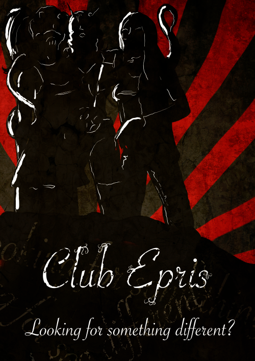
The club is easily recognised by many symbols that cause it to stand out in the grimy city of Dir’ht: women (and men) with tentacled shapes reaching from abdomens and skulls, elegant fonts, the question “Looking for Something Different?” and the very iconic Plaguenymph.

While the Wyrmwreyn are generally not accepted into society out of fear due to the ongoing war with a limited number of their kind, there are a growing amount of people that find them fascinating: these are the customer base of Club Epris. While they have no surface competition for Wyrmwreyn entertainment (all acting, music and seductive dances are performed in the one club), there are still human business places in large quantities competing with the various forms of entertainment that Club Epris provides. The club relies on the rarity of its staff’s species as well as the unnatural elegance of its establishment to sell their services.

The advertisements for the club will be provided through the web, in advertisements at the start of adult video games, through posters and through billboards around the town. These will range from the clean black and white elegance of the billboards that will be seen by many, to the grungy, red and black look of the posters advertising the location and events of the club. The digital advertisements all have a dark green and light brown theme drawing in audiences from a large variety of cultures in the city.

The company as a whole stands out with shock and elegance, a winning combination that has worked for them long enough to build the foundations of one of the largest clubs in Dir’ht.
Referencing Wednesday, Oct 14 2009 

Summary of my referencing, for anyone interested:


All Free Download. (2009). Vector Graphics. Available: http://www.all-free-download.com. Last accessed 10 October 2009.

 All Silhouettes. (2009). Female Silhouettes. Available: http://all-silhouettes.com. Last accessed 7 October 2009.

 Belenky, L. (2009). Yacht Club Beach Condo. Available: http://www.sunnyislesmiamirealestate.com/South-Beach/Yacht-Club. Last accessed 10 October 2009.

 Duan, S. (2009). Maps. Available: http://www.newenglandrna.org/3.html. Last accessed 10 October 2009.

 Kelowna. (2009). 2 Bedroom Penthouse Condo Quail Ridge Golf Resort. Available: http://www.kelownagolfski.com/pinnacle-2-bedroom-2314.htm. Last accessed 10 October 2009.

 Museum of Science and Industry. (2009). Venue Hire. Available: http://www.mosi.org.uk/venue-hire/conference-centre. Last accessed 10 October 2009.

 Sumell, J. (2007). Better Billboards. Available: http://www.baconinstead.org/community/?p=89. Last accessed 10 October 2009.

 Vijfwinkel, M. (2009). Textures. Available: http://cgtextures.com. Last accessed 14 October 2009.

Final Poster Wednesday, Oct 14 2009 

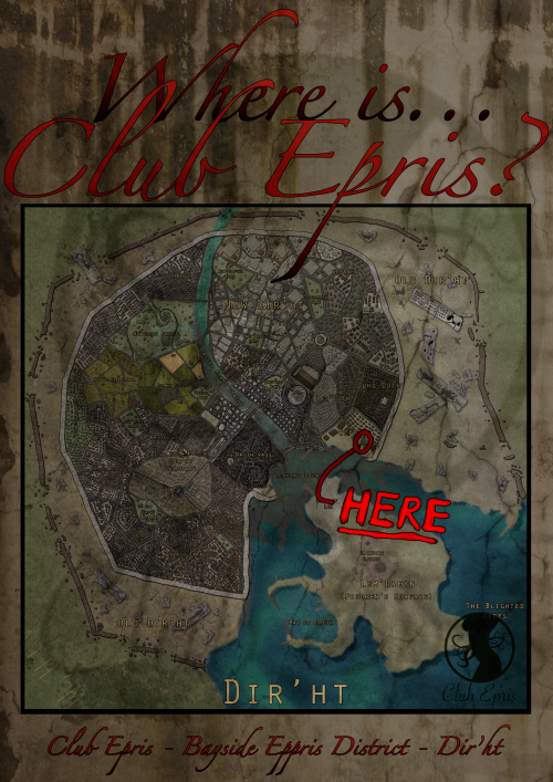
I doubt I’ll pump out another poster after this, I need to get my rationale done. But here’s a poster I created with my Dir’ht map I previously created. 

It’s a little simple, but as it’d be placed around areas where the club has been heard of but the location in question, this would be of little issue.

Finished third poster, as simple poster with the location of the club shown on a map of Dir'ht.

Finished third poster, as simple poster with the location of the club shown on a map of Dir'ht.

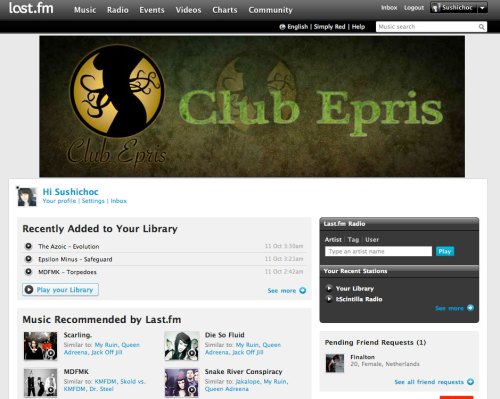
Web Banner in its natural environment. Wednesday, Oct 14 2009 

Preview of my web banner on Last.fm

Preview of my web banner on Last.fm

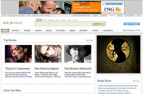
Preview of my web banner at a different size on AOL Music.

Preview of my web banner at a different size on AOL Music.


Showing some previews of what my banner would look like on two music websites, and showing how the same idea could be used in a different banner size such as on my AOL screenshot. The smaller versions could be animated or static, although I feel animation is essential to catching the eye. Having sound is a fast way to not only lose traffic to your website, but to the website that is hosting your banner.

Poster Progress Tuesday, Oct 13 2009 

poster2

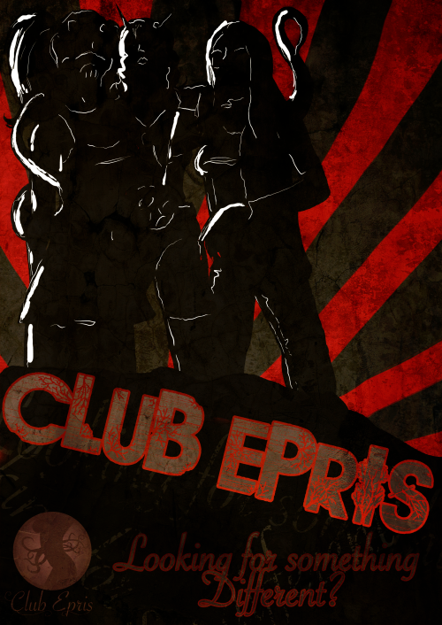
I think this is fairly close to what I want, if not it. Added a sepia-coloured version of the logo and changed the Club Epris title font.

I’m hoping I will be able to pump out one more poster tomorrow night while I’m at uni because I’d like to have three.

(Font used: Savoye LET and Route 3)

Poster Update Monday, Oct 12 2009 

poster2

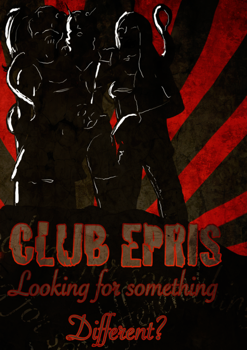
Still playing around with the poster font, this is just my latest major change.

(Fonts: Cracked and Savoye LET)

I was almost tempted to use Bleeding Cowboys font just to see if I could reduce how annoying it is, but then decided the irony would probably be lost and I’d just be remembered as just another person using that damn font.  Nothing can be done for an overused font, like Papyrus (which is acceptable only in VERY limited circumstances, not for cafes, clubs and kid’s fun factories like it’s often used!).

Finished Map Sunday, Oct 11 2009 


Finished map!

Finished map!

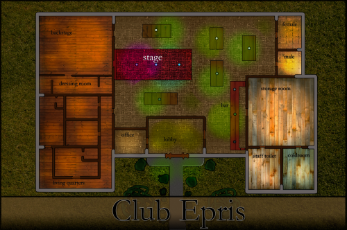
Well that’s my finished map of Club Epris. I’m going to go back and work on this poster now, because I’m really not happy with the font.

Map Progress Sunday, Oct 11 2009 

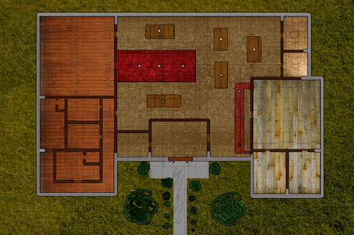
Going with a very warm atmosphere for my club, wooden plank flooring all around. I think I’ll be darkening the general area and adding neon lights to the map soon, as well as labels. Surrounding the stage are large tables which would be movable as well as the seating. The stage is also movable, being able to be shifted from being outward, to along the wall for strip shows or musical performances respectively. There is a large area behind the stage for all variety of costume area needs, even performances in acting when available. Behind the bar is a storage area, staff toilets and the cold room. There is accommodation within the club down the bottom left for dancers and staff that have no other place to live (common among Wyrmwreyn that are not accepted in society, or even among their own kind).

Progress so far. Textures from www.cgtextures.com

Progress so far. Textures from http://www.cgtextures.com

Map Ideas Saturday, Oct 10 2009 

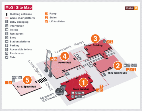
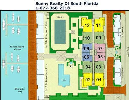
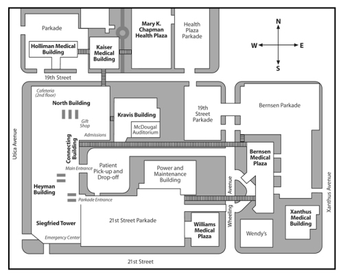
Just looking up some ideas for map styles before I start on this one:


Posters Again Saturday, Oct 10 2009 

Back working on posters again, finished this one in a rather short amount of time because it’s a simple concept that’s been done before.  I’m going to do up a map of the club after this post, because I think it’s necessary for me, as a designer and illustrator, to know what the club I’m working for looks like!


Finished Poster #2

Finished Poster #2


Inspiration

I don’t think I need to supply references because everyone’s seen this kind of thing, but here we go:

(more…)

Next Page »